
I Am Amplifier / Placard (week in progress 2)
- Kevin Tan

- May 14, 2020
- 1 min read
Updated: Jul 24, 2020
Headline suggestion
-Temptation into addiction
-End for your better future
-Weaker till you eat more
-End false, reality win
Moodboard reference


Initial Sketch Design


I’m using three different typefaces for the design which are Barlow, Monserrat and Vollkorn. This typeface have a minimalist look and fill. Not only that, I received some feedback from the lecturer that my design need to have a focus point and certain word need to be highlighted.
Final Sketch Design

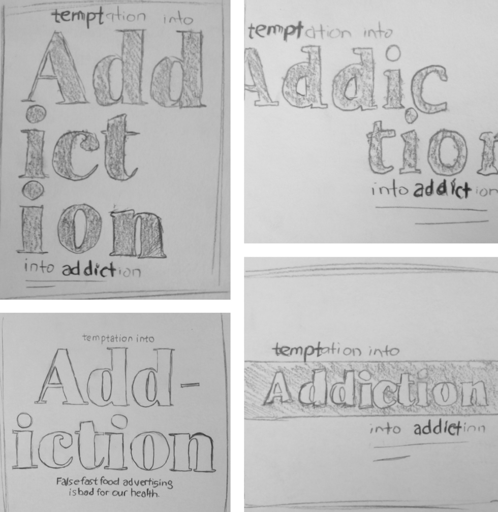
In my subsequence sketch design, I’ve received some feedback and amendment from the lecturer. As mention above, those two design on the left have been selected for digital. In addition, two various typeface have been used such as Abril Fatface and Petrona Regular. Further to that comparison have been made and I find it’s more suitable to be seen and understand from the last design in the bottom left as compared to the earlier design.


Comments